Tischlerei Martin Schneider

Tischlerei Martin Schneider

Brand Identity & Web app

Art Direction & UX/UI DESIGN

The creation of a unique and strong brand identity for the new business of a master carpenter led to dozens of new clients for him and his new employee.

Figma, Miro, Optimal Workshop, Adobe: Photoshop + Illustrator + InDesign, Google Workspace: Slides + Sheets + Docs + Forms

Tools:

Headline

subline

The Challenge

In 2020, Martin Schneider set up his own business as a master carpenter in Bensheim/Worms and the surrounding area. He needed a brand identity that would convey the values of his new company and stand out visually individually from the local competition.

The brand message needed to be uniformly visible across all channels and accessible via appropriate digital touchpoints. The ability to keep his online presence up-to-date by himself was very important to him.

Baumscheibe_Print
Autoaufkleber_3
Bestickung
KisteWeinflaschen
TrennerLightTransparent

Headline

subline

The Brand Identity

the Logo

The word-image brand is made up of several components:

The imprint of a tree slice, which was printed by hand in collaboration with the customer, immediately creates a reference to wood in the viewer’s mind. The distant effect of the tree disc resembles a circular saw blade.

The friendly yellow hue once again conveys the warm feel of wood as a material and stands out enough to stand out while differentiating it from local competitors.

The design language, with its focus on horizontal and vertical lines, takes its cue from current furniture design.

A sans serif script in dark gray communicates the company’s name, as well as the themes of modernity and professionalism, which are especially emphasized by the addition of „Meisterbetrieb“.

TrennerLightTransparent._oben

Primary colors

Woody
(#efc416, CMYK: 7/21/100/0)
*
Friendly Professional
(#9b9b82 cmyk: 41/32/51/3)
GentleRead
(#595753 cmyk: 62/55/58/31)

Secondary colors

#141414
cmyk: 73/67/66/81
#282828
cmyk: 71/65/64/68
#e3debf
cmyk: 62/55/58/31

the Colors

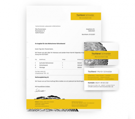
The main color was chosen to communicate warmth, friendliness and openness. Also in view of the subsequent external appearance of the workwear, which should clearly stand out from the competition.
The selected gray tones also have a warm undertone and convey professionalism and reliability.

For the texts, the color „GentleRead“ was chosen, which, in contrast to pure black, is less straining on the eyes (due to slightly lower contrast).

Some secondary shades of gray were added to ensure readability on colored backgrounds and provide further options for structuring.

Primary colors

The Font - Rajdhani

usage

style

Rajdhani regular (400) and semibold (600), used for Logo and Headlines

Font-size: web:2,5 em, print (A4):18 pt; Line-height:1.5em, 22pt

The

Headline

Rajdhani regular, used for Sublines

Font-size: web:1,8 em, print (A4):11 pt; Line-height:1.5em, 15pt; Letter-spacing: 0,1em

Subheadline

Rajdhani regular, used for Sublines

Font-size: web:1,8 em, print (A4):11 pt; Line-height:1.5em, 15pt; Letter-spacing: 0,1em

Listings |

Links

Rajdhani regular and bold

Font-size: web:1.1 em, print (A4):11 pt; Line-height:1.5em, 13pt;

Rajdhani regular and bold

Font-size: web:1 em, print (A4):11 pt; Line-height:1.5em, 13pt;

Wein-Etikett
Arbeitskleidung_Stickdaten
BestickteTaschen
FahrzeugbeschriftungSeite

Headline

subline

The Research

Competitive Analysis

A competitor analysis was conducted to ensure that the brand presence visually stood out from the competition.

The main finding that stood out was that, unfortunately, many carpentry/joinery companies do not have a user-friendly online presence, which is often outdated or lacks important information.

However, it was also noticeable that many elements such as contact details, image galleries and customer reviews could be found on many pages and are probably expected by users.


Main Findings:

Work in Progress

Survey

Who are the users and what do they want?

1. Who are our users and why, when, how, for what, and how often do they need a carpenter?

2. What do users expect from information, and where do they search for it?

3. What appeals to them, and what puts them off?

4. What/Who influences their decisions?

5. Which touchpoints and technologies do they use?

(Currently only available in German)

WordPress Cookie Plugin von Real Cookie Banner